

04 March . 2022
How Color Can Change Your Life
Feeling stuck in a rut? Color has the ability to enhance our overall mood and well-being, and that’s why it’s so important to understand how certain hues impact your emotions. While some shades inspire and uplift, others could have the opposite effect — without you even realizing it.
One easy place to start is with the Color(s) of the Year. It’s the perfect chance for some fresh inspiration, and you may just meet a brand-new color you never knew you loved. This year, green is having a moment — and as a community designed around principles of New Urbanism and shared green space, we are 100% here for it. Nearly all of our favorite paint companies chose a muted sage hue for their 2022 color, described by HGTV Designer of the Year Valerie Stafford as “nature‘s neutral.” Read on to see how these different tones can impact your emotional well-being.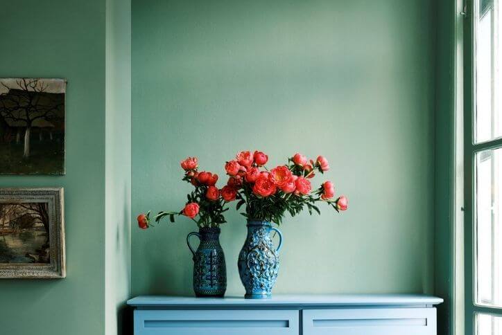
Breakfast Room Green by Farrow & Ball
First off is one of Farrow & Ball’s color trend predictions, Breakfast Room Green. Described as “the most cheerful of all our greens, lively in both bright sunlight or softer candlelight,” designers at Farrow & Ball say this shade can be used in numerous ways throughout the home.
Green is seen as the foundation of nature and represents balance and growth. The color is also associated with stability, healing, and harmony. You can use this adventurous shade as a background for art, or as a bright base color for some upcycled furniture. If you’re feeling extremely bold, you could also try pairing Breakfast Room Green with Stone Blue to evoke an arresting feeling.
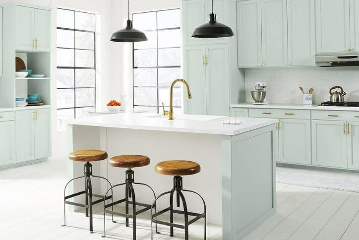
Breezeway by Behr
If you’re gravitating toward a lighter green, look no further than Breezeway by Behr. This gentle mint color is described as “a relaxed and uplifting sea-glass green expressing peace and tranquility for forward movement.” The new year is a great time to expand your horizons, and according to Erika Woelfel, Behr’s vice president of color and creative services, Breezeway “inspires us to fully embrace the hobbies or adventures, both near and far, that excite us.”
Similar to Breakfast Room Green, Breezeway is a great shade to use to bring the outdoors inside. The softness of this color is perfect for invoking a calming, soothing feeling in any room of your home, so if these are emotions you want to bring out, try using Breezeway to brighten up your kitchen cabinetry or home office space.
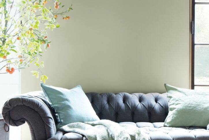
October Mist by Benjamin Moore
If the previous colors were too intense, October Mist by Benjamin Moore may be the green for you. Described as “evocative of the stem of a flower,” this gentle sage tone “anchors and uplifts.” Benjamin Moore pros also say this silvery green provides a great neutral canvas for other colors to shine.
Like Breezeway, October Mist can help promote a soothing, tranquil mood in your home. Do you find yourself unable to unwind after a long day? Try using October Mist as the primary color in your bedroom, bathroom, or any other room you use as a personal retreat. The subtle tone can help improve your mood while also lowering stress levels.
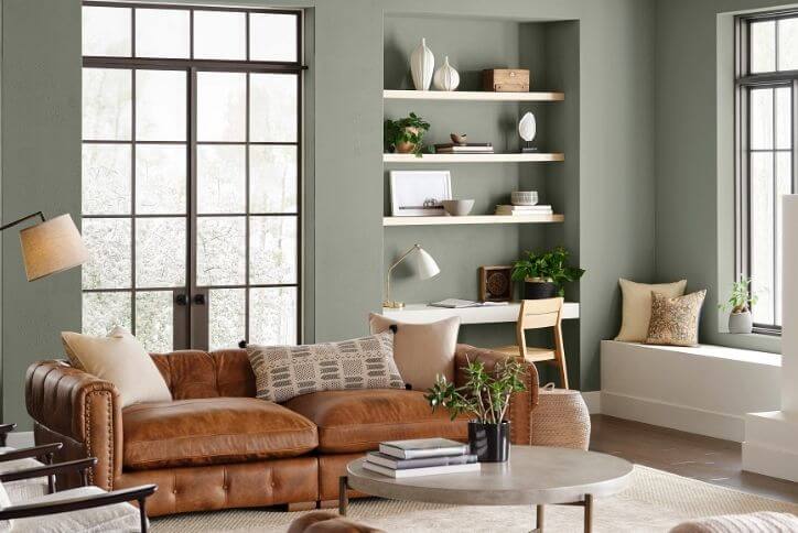
Evergreen Fog by Sherwin-Williams
Another silvery-gray mix is seen in Evergreen Fog by Sherwin-Williams. This chameleon green-meets-gray hue is described as a “sophisticated wash of beautiful, organic color for spaces that crave a subtle yet stunning statement shade” by Sue Wadden, director of color marketing at Sherwin-Williams.
Lighter shades of green tend to create a sense of new growth, or springtime. These airy tones can help you feel more energetic, while deeper greens like Evergreen Fog have a deeper, more reflective connotation. Muted olive tones can make your space feel more elegant and earthy, so one of the best ways to use this shade is by pairing it with warm naturals, such as beige or coffee brown. Using decor items that feature a lot of texture, like wood or leather, is another great way to elevate this color.
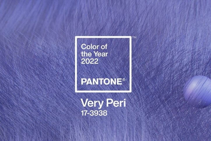
Very Peri by Pantone
Finally, we have the outlier in the colors of the year: Very Peri by Pantone. A new color “whose courageous presence encourages personal inventiveness and creativity,” this hue is designed to help people “embrace the landscape of possibilities, opening us up to a new vision as we rewrite our lives.”
Purple is thought of as an introspective tone, allowing us to connect with our deeper thoughts. The color typically represents imagination, mystery, and spirituality—and this bold blue-violet is a versatile hue that can be used to bring a bland space to life. Whether you plan to use Very Peri as an eye-catching mural of color, like a vibrant accent wall, or as a more subtle addition, as in glassware or pillows, this shade will heighten your receptiveness to creative ideas and your sense of beauty.
Is it just coincidence that green and purple are complementary and can provide your home with a balanced color palette? We think not. With the tones of nature and the earth as a backdrop, a shade like Very Peri can stand out as the focal point of any room, while you get the emotional benefits of both. Will you try any of these colors in your home?
If buying a new home is on your to-do list for the coming year, learn more about our growing community in South Hillsboro with a virtual tour, check out our wide selection of home styles, schedule time to meet a builder, or take a peek at what’s coming next. We can’t wait to meet you!